|
Old Style
Old style is not necessarily old, but has characteristics
that classify it as "old" or of the classic form.
- First among these is a slanted, tapered serif on the stroke.
This is the shape which would be formed by a brush or quill as
it might have been used to start or end a stroke. This serif
is also "bracketed" to the letter, that is, it joins
the letter with a bit of a curve rather than being draw perpendicularly
to the stroke.
- Second is the inclined counter. The counter is the "hole"
in the letter, like in the o, b, or p. If you hold a chisel pointed
brush with the point at an angle and draw a circle, the thin
and thick parts of the line set up with a backward slant to the
hole in the middle.
- Third is minimal contrast between the thick part of the stroke
and the thin part. Early paper and ink was so bad that there
was no good way to print either very thick or very thin lines
cleanly.
Garamond
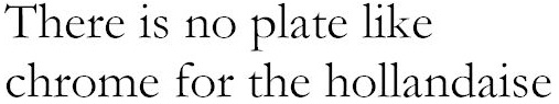
Cut in the 1600s by Claude Garamond, Garamond is considered
one of the archetypes of old style fonts. Notice the pennant
like serifs flying from the ascenders, the slight backward slant
of the Os, and the lack of contrast between the thin parts and
the thick parts of the letters.
Goudy Old Style
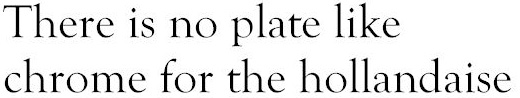
Fred Goudy was an active type cutter in the middle of the
twentieth century. This old style font, attributed to him, was
cut in the 1940s. Notice the similarities between this font and
Garamond. This font has a graceful bracket (the curving line
that connects the serif with the main line) on the serifs, making
them appear even more pennant-like. Also, this implementation
from the 1940s shows a little thicker wide stroke that gives
a little higher contrast between thick and thin strokes than
the earlier Garamond.
Centaur
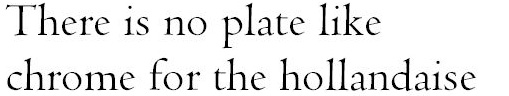
Centaur is a "revivalist" old style font cut that
was in about 1910. Its creation was part of a movement to recover
and use the older fonts that had been available up to the 1700s,
but that had fallen out of favor. Centaur is considered the most
elegant of all the Roman fonts but the digital version loses
some of its elegance due to the relative low resolutions of computer
screens and laser printers. Notice the slight narrowing in the
middle of the taller letters. This was done to make the letters
appear taller than they are. That delicate detail gets lost at
smaller sizes when it is displayed on low resolution monitors
and when it is printed on most dot matrix and laser printers.
With newer 1600 dpi printing technology coming down in price,
this font might make a revival. Centaur also sets up much lighter
than some of the other Old Style fonts. Compare its compact lines
with the Goudy above.
Are you wondering about the hollandaise?

|