Modern
In contrast to Old Style, a modern font has a very sharp serif
that joins the stroke at a precise right-angle to the stroke.
The counters in modern faces are straight up and down and there
is a larger contrast between the thick and thin parts of the
line.
Bodoni
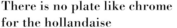
Modern fonts are not necessarily new. One of the first of
the "modern" fonts is Bodoni which was first cut in
Italy in the 1700s. Notice the hairline serifs and the very upright
look to the letter O. Advances in paper making and in ink made
it possible for printers to maintain the high contrast between
these thick and thin lines without the ink bleeding into the
paper fibers and blurring the page.
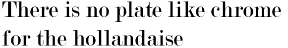
Perpetua

Perpetua is a brand new font created by Microsoft for digital
typesetting. It has a relatively long descender and a much more
delicate line than Bodoni. The characteristic upright O, the
perpendicular serifs, and the high contrast between the thick
and thin parts of the stroke mark this as a modern style Roman.
Perpetua owes more to Centaur than Bodoni in the way it sets
up and the color of a printed block of text.
Modern No. 20
Not surprisingly, this font--called Modern No. 20--is a heavy-set
modern. It might make a good title font, but it is difficult
to imagine having to read a large block of this as text in a
small size.

|