Transitional fonts have some characteristics of each of Modern and Old Style. They may have perpendicular serifs and low contrast between the lines. Or they may have tapered, slanted serifs with high contrast and upright counters. They are difficult to classify because of their combining attributes.
Baskerville, cut in the 1800s, is considered one of the earliest transitionals. The tapered serif on the foot of each stroke is the most obvious old style attribute and the high contrast in line width to most obvious modern attribute.

Bulmer is another old transitional font. Its primary old style characteristic is a tapered serif while upright counters and high contrasts are modern. This font used Bodoni as inspiration but has an old style proportion of x-height to ascender.
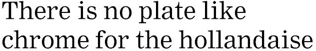
Nimrod is a new font that is designed for use in digital typesetting. Notice that it has the perpendicular serifs and upright counters but the low contrast found in old style fonts. This might make a better default font for basic word processing than Times New Roman because it sets well in longer lines and at the lower resolutions common with computers.

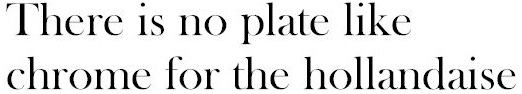
Times New Roman is classified as a Modern, but it might more properly be called a transitional font because of the faintly tapered, bracketed serifs and the inclined counters. It was cut in the 1920s for the Times of London when the newspaper wanted to update its look. This font looks nice in a short line, as in a newspaper column, but lacks visual appeal in the longer lines that are common to word processing. This is an unfortunate circumstance because Times New Roman is the default font for most personal computers.
