Script forms were considered "gimmick" fonts at the time they were first introduced, in that they mimicked the connectedness of hand-written letters. But cursive forms go back to the earliest days of printing when chancery scripts (monastic writing) were chosen as the basis for some of the earliest black letter forms. Later, as printing caught on and spread, the monks adopted lighter and faster forms to try to keep pace. These newer and lighter forms were also adopted and used for printing.

The italic for Centaur started out life on its own, as Arrighi, cut in 1928 by Frederic Warde. It is based on the classic Italian forms of the early 1500s. Its grace and elegance make it a perfect match for Centaur.

In a script form, the letters connect. Brush script is a venerable introduction of the 1800s that has been updated for use in digital typesetting.
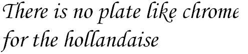
Corsiva is a modern cursive which was popular in the middle of the 20th century. The slight incline and the sweeping shapes give this font an elegant feel. Notice the 'e' set close to the extended foot of the 'k' in the word "like." The extended foot is called a "swash" and is common in cursive forms. The closely set 'e' is "kerned" to sit properly beside the 'k' while the swash works under it for decoration. Kerning is common whenever two characters of divergent shape sit next to each other. Kerning adjusts the letterspacing optically to make the text seem smoother.
